Logos are made with a perception and specific vision for any brand. But the choice of colors is very crucial at such times. Many brands even lose their beta testers just because of the color their brand. It’s quite simple; the UE/UI has to be attractive for any user to want to explore you more as a brand.
90% of beta testers choose to explore more if the brand’s color is appealing.
Color is a tool to attract the users without even talking to them. You can definitely try and measure the performance of this not-so-visible factor in your daily chores too. Choice of colors depends on various things like age, lifestyle, gender and experience. It works out with appetite, love and various other physical and mental changes in humans. Usage of colors to reach out to the mass is one of the most lethal weapons.

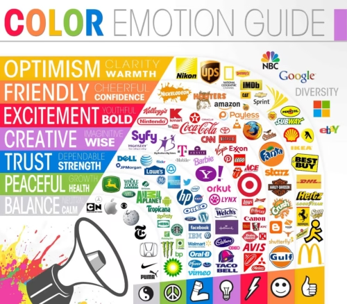
Let’s first get to know which color derives what emotion:
- Red: Strength, Warmth, Energy, Basic Survival, Excitement
- Yellow: Friendliness, Creativity, Extraversion, Confidence, Optimism
- Blue: Intelligence, Trust, Serenity, Coolness, Communication
- Black: Emotional Safety, Substance, Sophistication, Glamour, Security
- Pink: Feminity, Love, Sexuality, Nurture, Warmth
- Green: Harmony, Balance, Rest, Peace, Refreshment
- White: Purity, Sophistication, Efficiency, Sterility, Hygiene
- Violet: Vision, Luxury, Truth, Containment, Authenticity
- Brown: Nature, Reliability, Support, Seriousness, Warmth
- Orange: Warmth, Passion, Abundance, Security, Fun
- Grey is the only color that goes neutral and users just pass by seeing it.
This thing really matters when it come to something as big as making choices. A user who is new two social media platforms equally can choose to try the one which has the most appealing color. It may sound lame to many but if such a small thing can affect one user, it can affect many more too.

85% of users choose to keep using a brand because of appealing color.
Having a color that suits your brand is so impacting that many times when a user is confused between two logos, your color may help him recognize you as a good or bad brand in his mind. This is called brand recognition, but at what level does one seek to achieve it?
Men want it and women crave for it. Your sex is a huge sign that you’re choices are different than your opposite sex. This keeps happening with the choice of your brands too. Of course, the functionality of a social media platform will play a lot in keeping them hooked but initially what will drive users to you is how you look. That points out on UE/UI which again takes you to color.
- Men prefer; Blue, Green and Black
- Women prefer; Blue, Purple and Green
Looking at Facebook, Twitter, Tumblr, Skype and Foursquare many of you may agree with me on this one. So if you’re a new brand in the market and you want your beta testers to come like a wave of success to you, just don’t miss this!
40% of beta testers avoid their fear of checking more because of colors, It’s quite similar to the supermarket shopping. When you want to know more about something but you don’t wish to buy it at that time, you are afraid of the salesmen. You don’t want them to push you buy it. You can ask for money if they like you. Often when you’re running contests, campaigns or have a page that talks about selling a product can be doomed if wrong colors are chosen. Well, this makes sense because many readers don’t want to read something that tells them to pay. When users are reading something and they want to decide if they want to opt for that payment option or not, the color that gives strength makes them click on the button that will give you lots of money.
56% of sign ups happen because of a powerful color like red.
This happens because primarily, none of us have time to read something that doesn’t interest us. If we like an offer and want to take it we would just search for the button that makes it easier for us. However, if its of a color that makes you blind as a reader you will skip clicking on it and may want to think more and then come back to it later.
If you can’t remember, just underline it. Ones who are readers, specifically ‘books’ tend to underline things with pen or pencil that they want to explore more in future. The mark helps to remember and track it easily later. Quite similar is the hyperlink, but, why does it have to be blue and not some other color? It’s because the inventor of it wanted this text to stand out.
73% of users could easily choose colors that make things look easier. Blue is a color that give you calm and makes your communication channels smoother. Readers can easily read and figure out the difference between things with this color on Blekko, Dogpile, SubmitedgeSEO and ContentKo.
The Right color is surpassing the brand value of others. If a user has taken the risk of trying to use the features of a social media platform he will stay loyal when he is happy with the experience he had. This experience will include the features that were available to them there. It clearly means that the colors that are chosen in each page, tab or button will act together to make him land at a conclusion.
What if the user has avoided something because he couldn’t see it or didn’t like it, and it was the strongest or most unique feature of your platform. You will just lose the user who would have been loyal to you for years and would have even vouched for you on other social media platforms that, may be, are your competitors.
So if you are still running your brand with low identity, maybe this is where you were lagging. Just get a revamp and the results can be marvelous!
About the author;
Govind Agarwal is a Search Engine Optimization and Social Media Marketing Expert at Submitedgeseo, with over 6 years’ experience in the Web Marketing Techniques.

