When it comes to blog sites, less is often more. A simple WordPress blog set up with a reliable WordPress hosting provider can get the job done. This simple premise has made its way all the way to the design world as well with minimalist designs. If you’ve just finished setting up your WordPress hosting, you should consider going with a minimalist design. This approach allows you to keep your design simple, focus on the content and makes it easier for users to use or access the site. To show that minimalist design can be functional and beautiful, here are some of the top blog designs using this style.
1. Anagrama
Anagrama is a design firm that works in branding, UI design and packaging design. They’ve done away with the standard horizontal navigation menu and organized everything into two near columns. The header is a simple brand logo followed by the firm’s contact information.
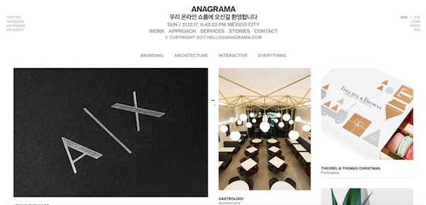
The idea here is to use a simple and consistent font, organized layout and minimalist user interface to allow their visitors to discover their work. Their blog content layout is organized into two columns with a small font size so that users don’t have to scroll down to read all of the content. This site is all about stripping away the unnecessary.
2. Neil Patel
Neil Patel runs a popular digital marketing blog. He sets up the blog in a direct response style by using the top of the fold to call out to prospects and convert them into leads. The top navigation menu is very simple and is static, meaning that it stays with you while you scroll down to the content below.
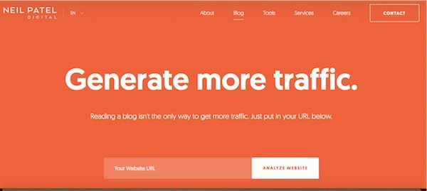
The blog posts are always accompanied by a high quality preview image and are set left then right in an alternating pattern. This layout is more attention grabbing than a standard one-column layout and helps each post stand out.
3. Un-Fancy
Un-fancy is a lifestyle blog that focuses on living a minimalist lifestyle. As the title of the blog suggests, there is nothing fancy about the blog’s design. However, it presents a clean and straightforward site that focuses on the content, high quality photos and user-friendly navigation.
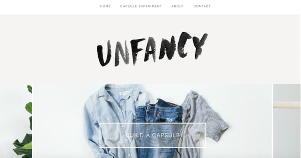
Many sites are littered with widgets containing random things and adding clutter to the look of the site. Un-fancy does away with this by putting enough space between the widgets and only including what’s necessary. They even use a drop down menu for their category and archives navigation to eliminate the long list of links that often bog down the sidebars.
4. Minimalist Baker
Minimalist Baker is a minimalist themed food blog that unsurprisingly uses a minimalist design. The blog uses a vintage style logo and a very simple navigation menu that’s intuitively organized. The blog is all white but it manages to capture your attention with clear graphical buttons and beautiful photography.
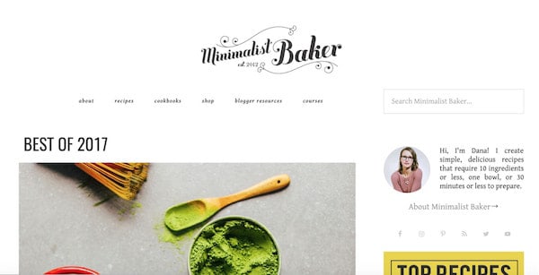
One of the biggest wins on the blog is the typography. Everything is so easy to see and read. The blog has done a good job on choosing the right fonts for both the headers and content. The helpful tags on the bottom of each preview post do away with the category section and quickly help you find what you’re looking for.
5. It’s Nice That
It’s Nice That is an art blog, so you can expect it to be visually driven. And it is, but not in the way you’d expect it to. The blog has a great balance of content and images so that everything has context. The big standout is the gird-based design. Everything is so well aligned and organized. This is one of the cleanest looking blogs that you’ll see in a long time. The look reminds you of high quality magazine publications.
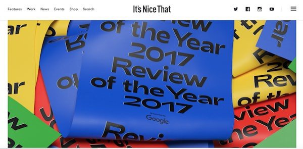
Just when you think you’re used to the three-column layout, the blog switches over to a six column, two column and then back to the three column. These layout switches allow you to discover new content and keep the whole presentation fresh. It’s something that large blogs should experiment with to combat blog post blindness.
6. I Love Typography
I Love Typography is a blog dedicated about typography. It uses a three-column layout – one with the main content, one with the blog navigation menu, and one that displays the latest fonts. Instead of trying to place their blog navigation on the top of the fold, this blog has made a wise decision to put it on the sidebar so that users can browse to other pages while they consume the content.
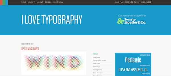
The column featuring the fonts is a smart way to feature unique content without trying to fit it somewhere on your navigational content. Three column layouts for blogs have gone out of style but this layout proves that it can work really well if you have a strong reason for using it.
7. Share Some Candy
Share Some Candy is an art blog that delves into everything from furniture, design, digital illustrations to videos. The first thing you notice is the site’s title in big type with multiple colors. The site itself is very simple but the color scheme and graphical accents really make it stand out.
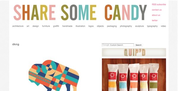
The site has a two-column layout but in the archive section, users can browse multiple categories by tabs. Once a tab is opened, pages are laid out in three columns and organized alphabetically. This is a great way to organize your information when you have so many different pages of content.
8. Swissted
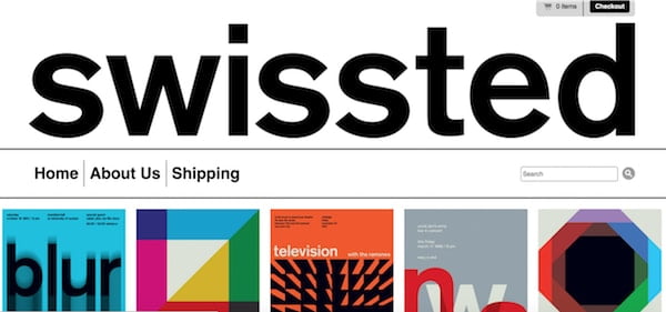
Swissted is a blog that features the art of graphic designer Mike Joyce. Many professionals want to do more with their personal sites but these sites call for less. Swissted is the perfect example of this. It has three links for the navigation with a search bar on the right hand side. It uses big bold fonts and texts to get to the point and lets the portfolio speak for itself in a neat and organized layout.
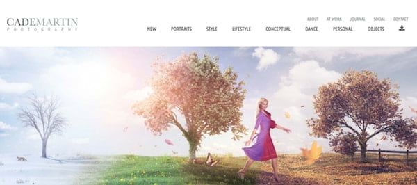
9. Cade Martin
Cade Martin is another site that focuses on getting to the point. The photographer uses two rows of navigation. One for his personal information and one for categories of his work. The photos speak for themselves and are presented in a card-based layout that allows potential clients to browse and discover his work without navigating through a uniform pattern.
As you can see, a minimalist approach can be both beautiful and functional. It is also friendly to mobile users. To make minimalist designs work, you need to use great typography, layouts, images and graphical accents to make your site stand out. All those small yet fundamental elements make way for your content and allows it to shine.

