With the COVID-19 pandemic, unfortunately, anticipated to stay longer, Google Maps added a new feature to its already long-list of countenances. This feature will be known as the ‘COVID Layer’. As per the makers, COVID Layer will deliberately present the information like the number of active cases, the percentage of cured cases, and all the relevant information in that area, which will help the users to take a call whether to visit that particular area or what specific precautions to be endured while traveling to that area.

The feature would augment the list of features on Google Maps with its release. Google Maps already has several known and even unknown features that help the users vivaciously in their travel. The video below demonstrates the various inbuilt features in Google Maps that are little-known to most of us.
Also Read: Here’s How Google Maps Live Traffic Prediction Works
What is the new-feature all about?
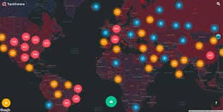
Google Maps, knowingly one of the most commonly used applications by almost all, has now introduced a calculated list of COVID-19 outbreaks in your area. The new feature is set to deliver a seven-day average of active cases per 100,000 people for a particular area of the map. The users can vividly distinguish the densely affected area from the least affected ones, with the help of a special colour coding feature. The technology giant announced that the colour coding feature will make the feature most useful.

How will the COVID layer device the information?
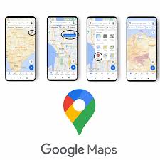
In a blog post, Google described that the information on Google’s new COVID Layer is easily accessible. On the right corner of the application, there would appear a button called ‘COVID-19 info’, which will carry all the data for the same. Google Maps can easily use this feature by tapping on the ‘COVID info’ button that will direct to a page that will supposedly picture the various affected areas with their density of cases. Google claims that this feature is going to be efficient enough to deliver the average counts of COVID-19 cases, thereby providing a good window to the accessible areas and the not very accessible areas in regards to COVID.
Public health organizations like the World Health Organization, government health ministries, in addition to the state and local health agencies and hospitals are responsible to gather information related to the active corona patients, cured patients, casualties for the same, and all pertinent data. This data is collectively then handed over to different sources like Wikipedia, JohnHopkins, the New York Times, etc. Google will then collect the same from the relevant COVID-19 information from these sources.

Google will indicate all the collected information in a clear location-wise guide, as a calculated output of a seven-day average of new COVID cases per 100,000 people for your particular area on the map. A dedicated label that will indicate the trending case situation, whether scrolling up or down. The sources confirmed that the feature will picture the data clearly with the help of colour coding attribute added to this feature. This attribute would be enabled in Google Maps for all the 220 countries or territories along with state or province, county, and city, that it supports.
While the COVID-19 cases are increasing every day in numbers that are growing difficult to be contained, this COVID Layer tab added by the technology giant will surely help alert the users and provide valuable assistance on taking a decision to travel to that area accordingly. Till a powerful dedicated vaccine to kill this coronavirus takes its grounds, it is really quintessential to take the precautions. Now, we need to wait and learn, whether the usage statistics of this particular tab will be anywhere equivalent to the dynamic ratio of usage of Google Maps.

